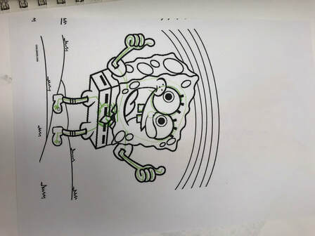
Section 1Part 11. Explain the art criticism process.
Part 2
0 Comments
Process:
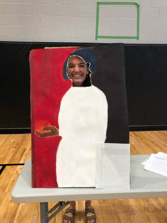
We first cut out a long piece of canvas paper and then trimmed in accordingly. Then, we hot glued the canvas paper to a flat piece of cardboard. Next, we traced out the outline of the woman's body. Then, we painted the left side of the painting by mixing a 3:1 red to yellow ratio. While two of us did that, one of us was painting the right side by mixing red, blue, and black. Following that, we painting the woman's body white. Then, we painted the woman's hair by mixing blue and black. We then painted her hand brown and the fruit orange. Next, we cut out her face with a cardboard cutter and scissors. Finally, we hot glued a bottom piece of cardboard and two back pieces to the cardboard we already had so that it would stand.
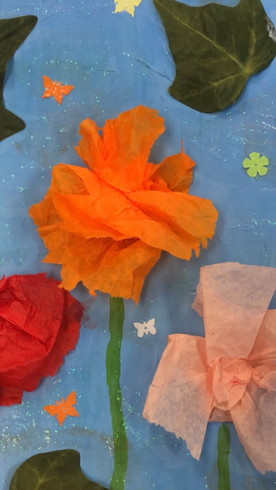
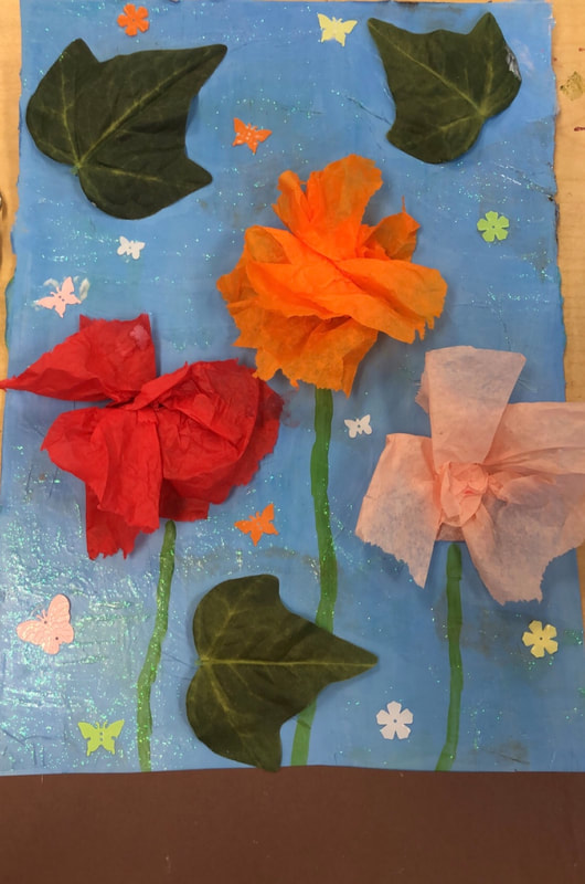
1. I used 6 mediums and techniques. The first one I used was paper mache. This helps to create a base for my project. I used tissue paper and applied glue to it and did this to fill up the whole paper. The next medium I used was paint. I painted over the paper mache to create a light blue sky. Next, I applied another layer of paint: the stems. The next technique I used was crumbling tissue paper. I did this to create the flowers. The next medium I used was construction paper. For this, I cut a piece of brown construction paper and put it on the bottom of my project to create the dirt. The next technique I used was to put on leaves and small butterflies and flowers on the background to create dimension and detail. The last technique I applied was glitter glue. This allowed for texture and dimension.
2. Instead of using my word, I use the descriptive paragraph. This paragraph said to look around the outdoors and let it inspire me. I looked at my front yard and in my front yard, I have a few flowers growing. So, my project portrays this because I decided to put these flowers into my project. Warm-Ups
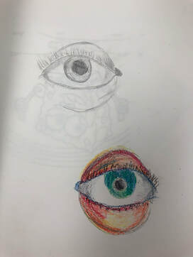
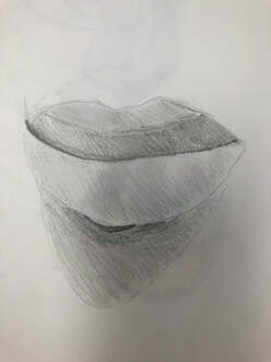
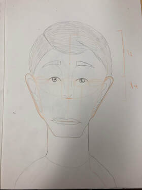
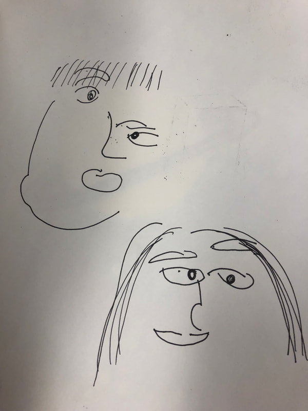
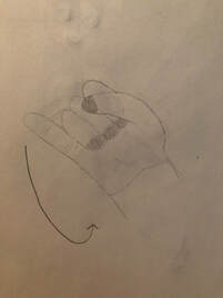
Responses1. Face proportions was the most helpful warm up. This is because the face is shaped a lot differently than I thought and so if I didn't learn about its proportions, my face would have looked a lot different. 2. The most surprising thing I found about the face proportions was that the forehead is about half of your face. Portrait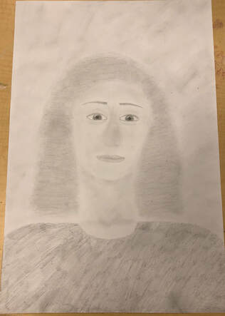 Responses1.I did my portrait of Charlotte. Charlotte is one of my best friends that I dance with outside of school.
2.The medium that I used was pencil. 3.First, I drew the face and sketched out the proportions. Then I began with the eyes followed by the eyebrows. Next, I drew in the nose and then the lips. Next I did the hair. To do this, I made curly lines and shaded/blended until the hair looked how I wanted it. Next, I shaded in her skin and blended it out. Then, I drew her shirt and darkened it. Lastly, I shaded in the background to give the piece dimension. 4.What I found successful was the face proportions because they look realistic. What I would change next time would be to make the face darker so that it doesn't blend in with the background. Sketch of Linocut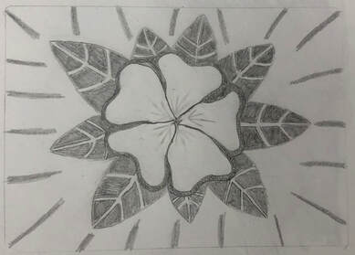 Linoleum Block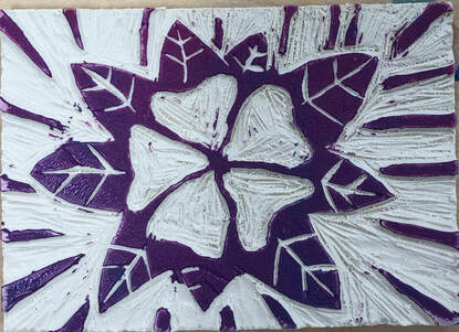 Finished Print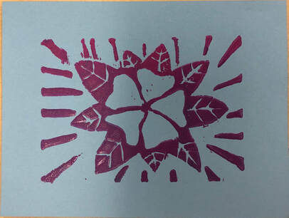 Responses1. My piece shows off the theme of "line" because my entire piece consists of them. I have lines that i had to cut out for the stems in the leaves, the sides of the leaves, and even some in the background.
2. My piece is successful because it clearly shows a flower with leaves and is representative of the line of "theme". If I were to do it again, I would probably add a bit more detail to the center of the flower. Also, I would probably have perfected the lines in the background and make them go from thicker towards the side of the paper, to thinner towards the flower to add more dimension. FinishedAngle Shots
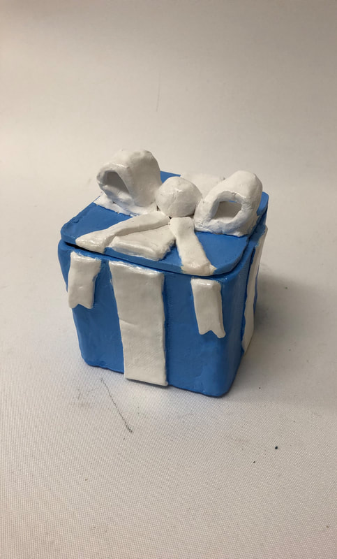
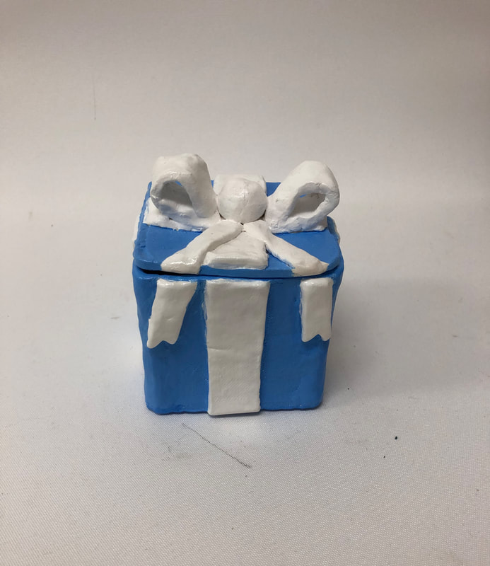
Detail Shot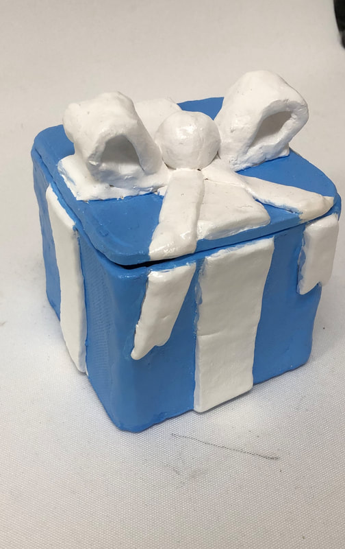 Responses1. Since my in process blog post, I have painted my piece with acrylic paint. After I did that, I sprayed my piece with glaze. 2. In my piece, I find my slabs the most successful. They are very smooth and make the box look like an actual present. 3. If I were to do it again, I would have used glaze instead of acrylic paint. Also, I would have tried to make the ribbons a little more precise. In ProcessPiece in Process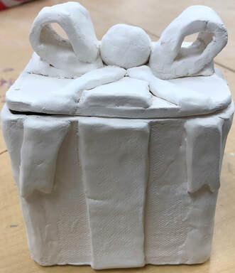 Responses1. Next, I plan to paint my piece with acrylic paint. I will paint the ribbons of my box white and paint the wrapping paper light blue. After the paint had dried, I will apply a shiny coat to the piece.
2. What I found difficult was forming the box itself. It was hard because I had to measure each individual side as well as the top and bottom. The sides had to be exactly the same size and thickness which was especially hard when I did different sides on different days. It was hard to make the top because I had to make it able to fit like a puzzle. It was also hard to score and slip everything together without having anything break, crack, or fall apart. 3. What I found successful was how strong my piece is. It feels very sturdy and unlikely to break. I also like how the ribbons turned out because I was afraid they would break in the kiln. 4. First, I cut out 4 identical slabs: 1/4 thickness, 4 inches wide, 4 inches long. Then, I scored and slipped the 4 slabs together until they made a box. Next, I made the bottom of my box. I cut out another identical slab and scored and slipped it accordingly so it would fit on the bottom. Next, I made the top. For this, I had to trace the top opening of my box so that the top would fit like a puzzle on top. Then, I cut 4 identical slabs of ribbon and put each on one side of the box. Then, I created 4 little notches on the bottom of the top of my box. Next, I created the rest of the ribbon by molding the clay and scoring and slipping it onto the box. Lastly, I put my piece in the kiln. My Watercolor Piece
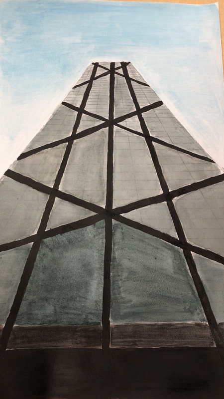
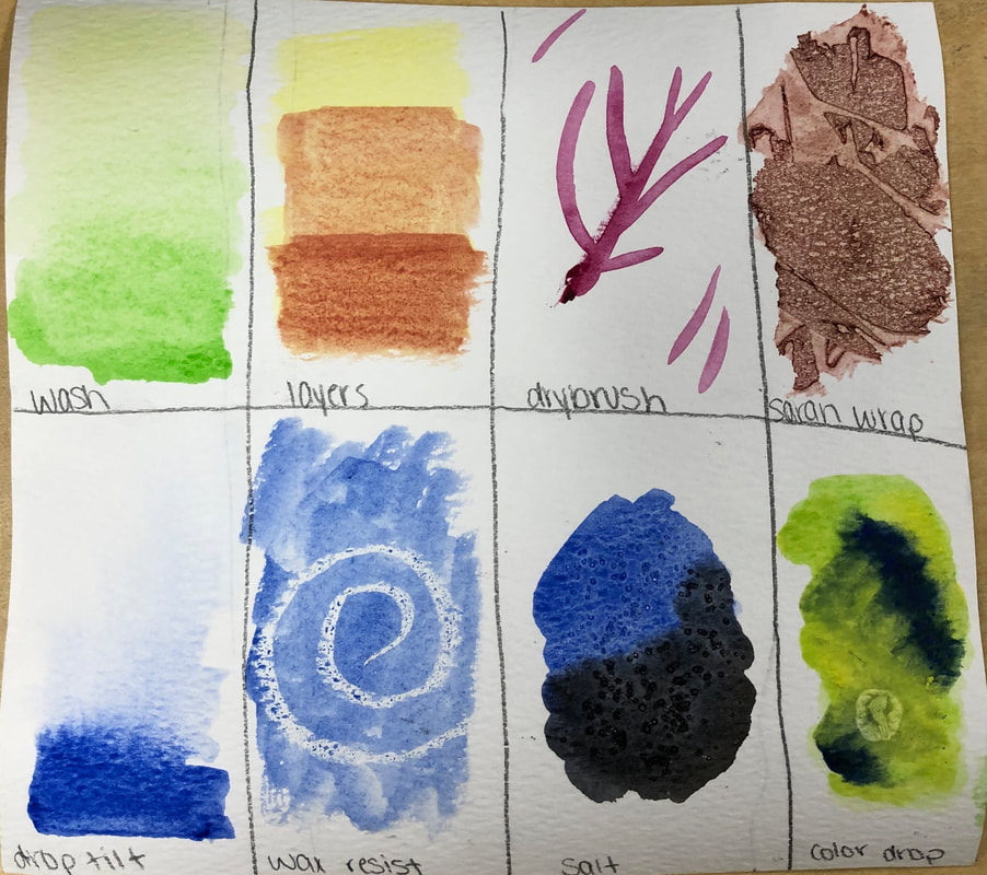
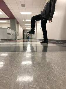
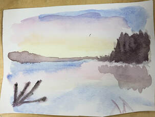
Responses1. I used the three-point perspective. 2.This photo is of the John Hancock Building in Chicago when I went there 2 summers ago. 3. What I found difficult was making the building look tall. I had to think able the angles of the lines that I drew. 4. The watercolor technique warm-up helped because I used a lot of color drop in my piece and I wouldn't have known how to do that if I didn't have that warm-up. The forced perceptive photography warm-up helped because I was the one taking the pictures and so it made me think about where to position the camera. This helped me when painting my piece because I was able to know what angle to position my lines in my sketch. Watercolor Warm-Ups
1. I found the watercolor technique warm-up the most helpful because I was able to learn how to use watercolor in other ways to create more realistic looks. I ended up using a lot of color drop in my piece and so it was helpful to learn how to do that.
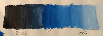
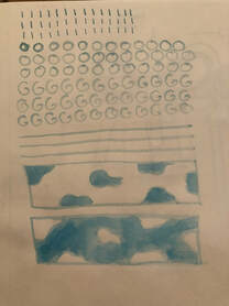
2. I really like how watercolor looks. I like how it doesn't necessarily look the same in every part of your piece and how it adds dimension. 3. The hardest part about water color is maintaining it. Sometimes when you are painting, the water will move around. Sometimes, it is hard to create the same exact color and is hard to paint over dark colors. Hue Value Scale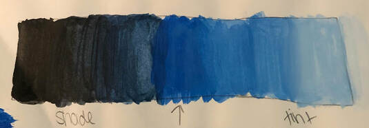 Most Helpful Warm-up: Brown Swatches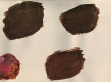
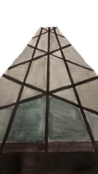
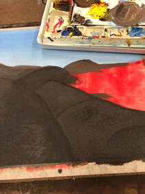
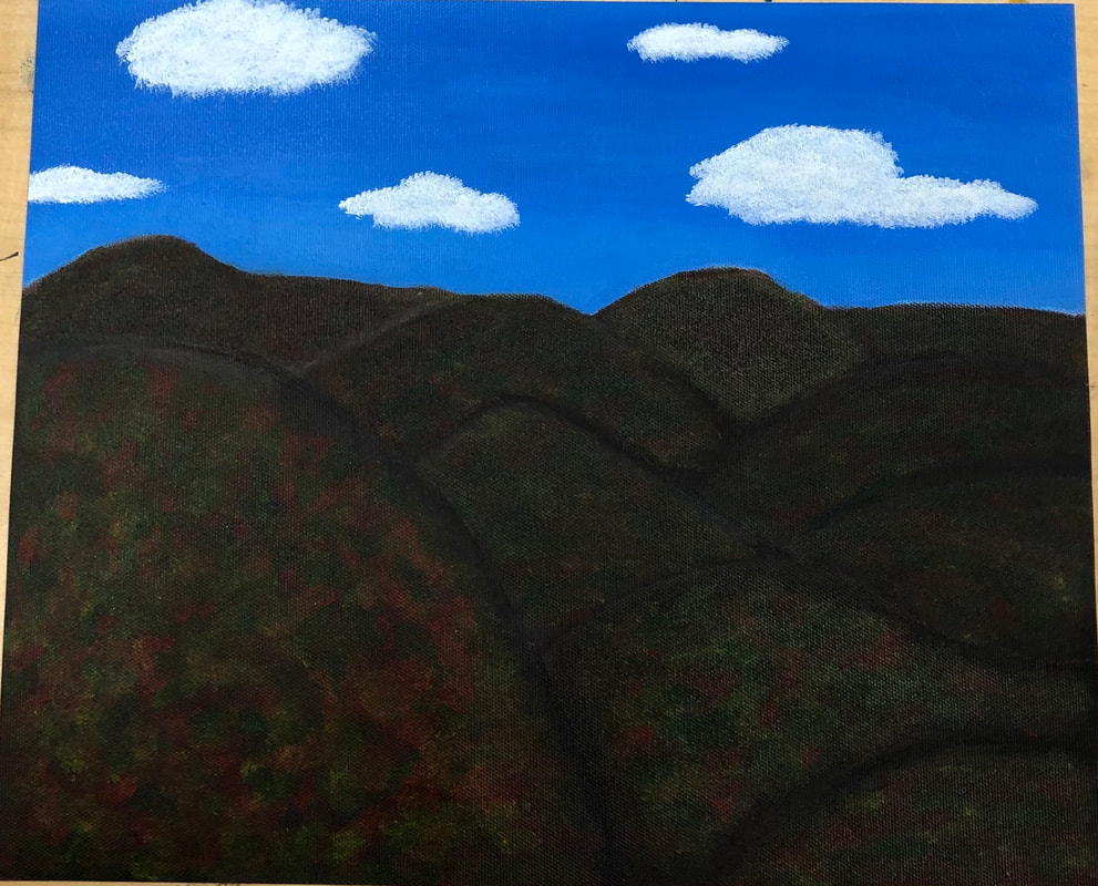
Responses1. The Appalachian Mountains are represented in my art. It is important to me because we drive through these mountains when we go to Tennessee to visit my grandma who is suffering from Alzheimer's. They make me think about her and are a part of the journey.
2. I found the mountains to be the most tricky. This is because I had to think about how to make them seem overlapped and textured. I tried to make the mountains seem lighter in the back but it was really hard. 3. I feel that the colors in the mountains are the most successful because they blend together nicely and look realistic. 4. First I took a base coat of red and painted the whole canvas. Then, I painted the sky, adding shades of blue towards the top and tints towards the bottom. Next, I painted the mountains. I created brown using a mixture of red, blue, and yellow. I had to create a shade of brown my adding black to that mixture and painted the outline of each mountain. I tried to create a smooth transition of the brown of the mountain to the shade of the outline. I also tried adding white to the red, blue, and yellow mixture for the mountains in the background to make them look a little lighter. Once the mountains were fully dried, I painted the colors in the trees. I did this by adding a bit of each color (red, green, and yellow) onto my brush and repeatedly dabbed the color onto the mountain. I did this until the colors were nicely blended and looked realistic. Lastly, I painted the clouds. I used the same technique that I used with the colors, except I used white and added more paint onto my brush. I did about three coats until the clouds looked fluffy and full. |
AuthorWrite something about yourself. No need to be fancy, just an overview. Archives
June 2019
Categories |


 RSS Feed
