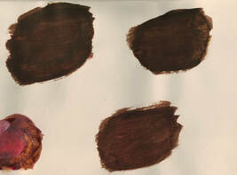
Hue Value Scale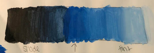 Most Helpful Warm-up: Brown Swatches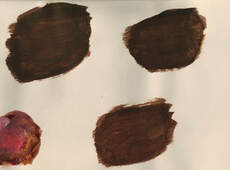
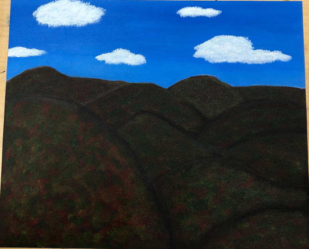
Responses1. The Appalachian Mountains are represented in my art. It is important to me because we drive through these mountains when we go to Tennessee to visit my grandma who is suffering from Alzheimer's. They make me think about her and are a part of the journey.
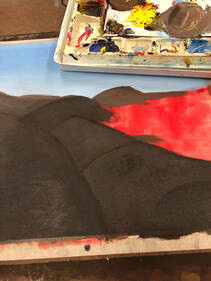
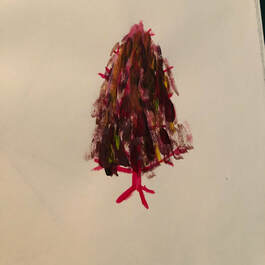
2. I found the mountains to be the most tricky. This is because I had to think about how to make them seem overlapped and textured. I tried to make the mountains seem lighter in the back but it was really hard. 3. I feel that the colors in the mountains are the most successful because they blend together nicely and look realistic. 4. First I took a base coat of red and painted the whole canvas. Then, I painted the sky, adding shades of blue towards the top and tints towards the bottom. Next, I painted the mountains. I created brown using a mixture of red, blue, and yellow. I had to create a shade of brown my adding black to that mixture and painted the outline of each mountain. I tried to create a smooth transition of the brown of the mountain to the shade of the outline. I also tried adding white to the red, blue, and yellow mixture for the mountains in the background to make them look a little lighter. Once the mountains were fully dried, I painted the colors in the trees. I did this by adding a bit of each color (red, green, and yellow) onto my brush and repeatedly dabbed the color onto the mountain. I did this until the colors were nicely blended and looked realistic. Lastly, I painted the clouds. I used the same technique that I used with the colors, except I used white and added more paint onto my brush. I did about three coats until the clouds looked fluffy and full.
0 Comments
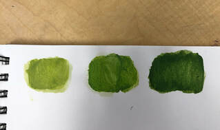
Photos of color matching (purple, orange, Green)
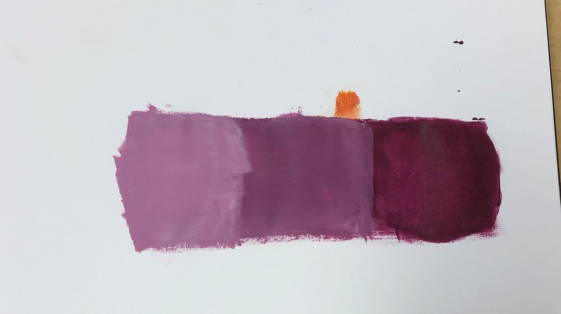
 Tint/Shade/Tone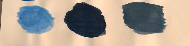
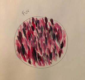
Textures (rock, fabric, fur)
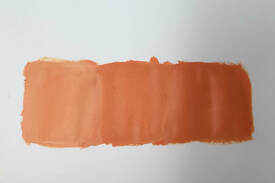
Fabric 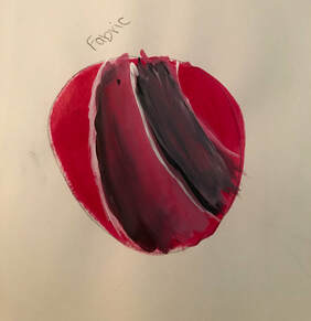 Gradient of a color (light to dark, smooth transition)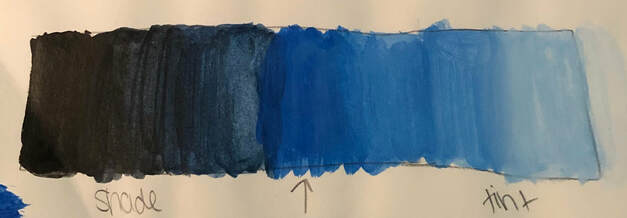 Response Questions1. From these activities, I learned:
3. The one that I learned the most out of was the textures because before I had no idea how to create a texture out of paint. Now, I understand how to even though it wasn't as successful as I had hoped. 4. Some ways to make brown are blue-orange, purple-yellow, and red-green. You mix a primary color with it's complementary color. Mixing in some others colors may help too. 5. In order to tone down a color, you can either add gray to it or add to it it's complementary color. Pencil Drawing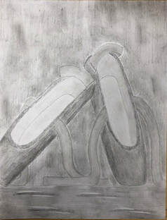
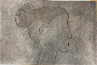 Pen Drawing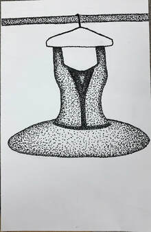 Most Helpful Warm-up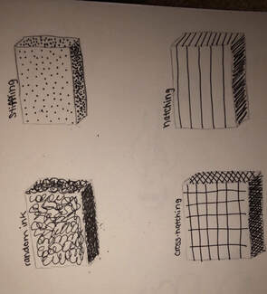 This pen warm up was the most helpful warm up during this unit because it taught me how to draw with pen. Before this warm up, I just thought that you drew in pen like you drew in pencil. I didn't know there were specific techniques you could use. This helped me a lot because I only used stippling to make my tutu, and without that knowledge of how to do it, it wouldn't have turned out the same. CompositionComposition is how the visual elements and components of a piece of artwork are arranged. ValueValue is the element of design that signifies the lights and darks in a piece of art.
|
AuthorWrite something about yourself. No need to be fancy, just an overview. Archives
June 2019
Categories |
 RSS Feed
